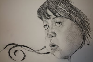
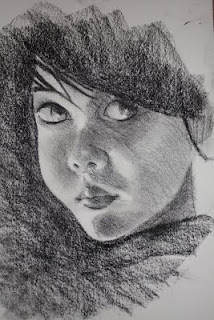
 Charcoal on 9 1/2x12" on Strathmore.
Tuesday, October 13, 2009
Wednesday, September 30, 2009
Inspired by Gottlieb's

 Graphite on Bristol vellum . "Portrait of Victoria", as titled by Adrian Gottlieb, is the original artwork of which this one got its inspiration. I did this in between taking care of my new baby and it took for about 4 days to finish it. I am so drawn to marveling Gottlieb's rendition of the eyes that has brought tremendous challenge to my part. I think my version made the subject look 10 years older. The original work is, of course, by far better in all aspect. Click the title and see it for yourself.
Monday, September 28, 2009
Study of Glenn Beck
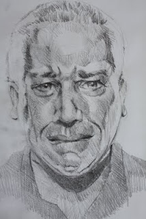 Graphite on 9x12 Canson paper. I could have drawn a straight face of my favorite tv and radio news commentator Glenn Beck, but I chose to do this because I find him very animated, entertaining, and passionate; and so I find this face more fitting. I got the lighting on this subject on both sides and I hope I defined it clear enough. The tone of shades on different areas is suppose to make justice of it's articulation. It's something more challenging; I did this for about an hour an a half. His show comes on the FoxNews Channel at 2 and at 11pm PT, and I have been religiously watching his show now that I'm on vacation. I've read his book, "Common Sense" and his new one, "Arguing With Idiots" will be next. If the current events and political bickering is not making sense to you, watch Beck's show. Lots of common sense. In this drawing Glenn is suppose to be grimacing with tears.
Sunday, September 27, 2009
Head study of Mark Levin
 Graphite on 9x12 Canson paper. I did this sketch in the style of Dave Malan's cross hatching. I did this for about 30 mins. It still need working but it's not that bad, just getting used to it. Giovanni Civardi, an Italian artist, is also one that I admire of their cross hatching drawings. Mark Levin is a radio news/conservative commentator and a brilliant constitutional lawyer. At first I was turned off by his belligerent screaming and cursing at the microphone on the radio station that I listen to, 790 kabc AM. After giving time and chance to listen to his piece, I came to realize that he has got substance and arguement in every point he raised. The guy is a smart and learned in the Constitution and Law, that he has short fuse on people who are openly stupid enough to be in the office wasting our tax money, continually destroying the fundamental freedom and sovereignty of America, and disrespecting the God-given values that our forefathers have laid on to us in the Declaration of Independence. We have a lot of public officials presently and continually doing that, both from Republican and Democrat party. Not only that I listen to his show and I also have read his book, "Liberty and Tyrrany". I consider him a mentor ,and in a culture war that we're in , aside from Bill O'Reilly, he's my hero.
Head study
 Compressed Sanguine on 9x12 Canson paper. Using a stick is one of the few things that I ever done because it is simply difficult. It takes a skill on how to hold a stick so one could get a certain result; either an edge line, a shade of tone, or the fluidity of a stroke. I know I have to grind the learning of it. Nathan Fowkes is one artist I know who has acquired this mastery. Perhaps, in the future you would see more of my artworks on this medium and see how I fair.
Saturday, August 29, 2009
Another one from Dave Malan
 Graphite on 9x12" Canson paper. This is another reproduction of Dave Malan's work. I used a 7B graphite on the top hair that is why it kinda' stood out all over; the rest of the hair was done by HB. I learned that Malan uses one grade of pencil, varying the pressure for darkness and lightness. I thought of using various grades to avoid getting kinks on paper caused by pressures. The face was mostly done by HB. I didn't quite like my rendition of the lips, top dark hair is just a sore in the eye. I post this anyway.
Friday, August 28, 2009
Inspired by Dave Malan

Graphite on 9x12" Canson paper. One of the artists that I admire, Dave Malan, whose drawings doesn't require so much of strokes to express a ton of information. And because I don't have to exhaust hatching, it forced me to back off using my pencil and analyzed the plane and volume of the figure. I'm getting this concept of -less is better. Malan understood anatomy well enough that his drawings are clean and crisp. Moreover, he emphasized on the extreme contrast of light and dark. I spent 20 minutes copying Malan's work; of course, it is not as good as the original but this artwork stands good enough by itself.
Thursday, August 13, 2009
Parade of Oddities
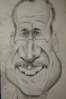
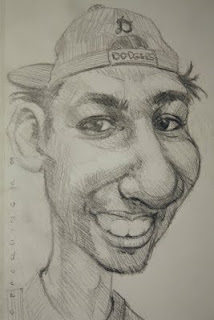 Technical Pencil on 5.5x12" Strathmore paper. I drew and processed these two artworks in a number odd ways: first of all, I was not using the usual pencil. I didn't have my graphites with me and I just got to use whatever I can grab out of necessity for some odd reason. The techincal pencil was a token of consolation for the time and effort rendered at my jury service, which is another oddity. The paper size is not even ideal as its width is too narrow, its lenght is too long. Anyway, on top is Ramiro M and above is Mike H., both are my boys from work. I am in a mission of trying to draw the whole department as much as possible. Why? Another question which I don't have an answer. In addition, the part that I am most excited about, I am experimenting with my new Canon XSi camera and the Adobe Photoshop Element 6. It's real cool. When I shoot these two artworks, after attempting too many times to my satisfaction, I thought of disabling the flash, but the result was yellowish; with APE 6, I clicked on "Auto Color" and, the photo switch instantly to its normal white (I thought that I should write this down so I will just have to read it in case I forget). Then another one for the parade, somehow this pc was having a hard time of browsing these particular files that I could not post, and by shear flawless-ingenuous thought process as normally my brain would react in a distress situation (pardon my modesty), I thought of just dragging the images from the photoshop album to another file of a different window where I'm used to exracting photos for posting. Voila! The result was a success, and here are the two artworks in their crisp and clear images! I will definitely do these studies again in graphite and in more finesse strokes. Lesson learned (let's just pretend): let persistence finds its own way of getting things done no matter how much odds are up.
Monday, August 3, 2009
Rick T

Graphite in 9x12" Strathmore paper. "I like 'em thick, dawg!", as he would usually say refering to his favorite subject of conversation -- FBG (fat bottom girls). Since then on, it has become an expression of humor through out the department. To tell you the truth, as "thick" as he is himself, he was the sneaky one who came out from behind the race in the 6-month weight challenge we had, and ran pass me to claim victory. He lost 37 pounds; I had 31. I got to give him props for that! The lesson I learned: never join any weight lost challenge if you're not fat enough to lose a lot of weigth. At the end part of the challenge, for no matter what I do, I platuea-ed and lost no more weight; I never thought that I have reached my bottom already at 151 pounds!
I find this drawing quite easy and fast. It's not that bad.
Saturday, August 1, 2009
Tinker Bell - a study
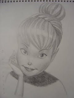
Graphite on 9x12" Stratmore paper. I guess from now on I will have to start soaking myself into the world of Disney as my new arrival is coming on mid-September. I just finished painting her room with pastel colors: pink, off-white and mauve with pictures of green Tinker Bell on the border. The above artwork is a study of Tinker Bell I made as I am planning to draw it in chalk pastel then frame it for her room. I still have lots of stuff in line. I am so excited and our anticipation is building up as we get closer to her arrival. This will be my first and I can't wait to be a father. I'm imagining myself watching Disney channel all the time, learning all the nursery rhymes, not to mention the sleepless nights and diaper changing. I don't know how will it affect our everyday routine, that includes my time for hobbies, all I know it will drastically change. I might be away from my blog very often and slow down on posting my art. After I get enough practice with Li'l Megan, it'll be all good for me.
Mike H

Garphite on 9x12" Canson paper. My boy from Texas. At work, somehow he always get his way around the system to his advantage: "Can you cover me at 5? I have to pick up my girl from the hospital; it's an emergency." He carries himself with confidence with a certain cocky attitude. He picks up his charm when surrounded with lady nurses specially at ICU, not bad for a young kid. He'd be screaming his heart out inside, but still wearing that poker face outside. He would share to us what happened.
In every funny face that I do, I believe that for as long as I get the eyes down, that's more or less a home run; I can play with any degree of exaggeration on the rest of the features. In Mike's case, I got his cheeks, brow ridges, and his pearly teeth at play to an excess. I see the resemblance more or less, but not quite satisfied.
Wednesday, July 29, 2009
Darrel CJ

Graphite on 9x12" Canson paper. We call him the "walking google", known for his intelligence and quick wit. A real nice guy, team player, hard worker, but a little wierd, at times. Either you would see him reading a book in a corner or doodling cartoons with his fast hand --he could be a great cartoonist/writer. He's aspiring to be a nurse someday; I think he has the knack for caring sick people.
I still continue on experimenting drawing funny faces from photos. After doing a number of them, I find it a bit challenging now on trying to catch each of their distinct likeness, no matter how exaggerated their features are. Although they're all my boys from work and I am pretty much acquainted with them, I reckon that this drawing process is still a hit and miss. Perhaps, if I repeatedly work on them I would somehow get the result I have been looking for. I might have to call these works "a study". When I went through Seiler's and I see some of his subjects he repeatedly worked on different poses and perspectives, it amazes me how he masterly keep it interesting and funny with their likeness intact. He may have exaggerated a facial feature, like the lips or a nose, and it would still look who they really are. I mean, man, how does he do that?!
Saturday, July 18, 2009
Mike K

Graphite on 9x12" on Strathmore paper. Known as "Big Dawg Daddy", "Pitbull", or to some, "Bully". I made him look meaner and intimidating with thicker eyebrows and mustache of the defunct Sadam Hussein; somebody who you don't want to be in your way, or get his attention and be his subject of ridicule. Run before he gits ya!
Friday, July 17, 2009
Salah - The Righteous

Graphite on 9x12" Canson paper. He's the brother from Egypt that I never had. Never compromising, he always stands for what he believe is right, regardless. Always ready to lend a helping hand at any time, no matter what it takes. He's surely living up to his name -the righteous. A very pious man who has read the Bible from cover to cover more than many times than anybody I know. He's excited to be the Godfather of my first baby due on September. That would make us both next to being real brothers. The guy is a good man, what else can I say?
I would have to look at Seiler's works as reference for me to come with something on my own. I'm kinda having fun doing this funny faces of friends, it's relaxing though still challenging. My works hasn't gone that exhageratingly interesting or stirringly funny, not as Seiler as yet. I am still testing the water and see where will it take me.
Thursday, July 16, 2009
Sleeping Willow
Monday, July 13, 2009
Darwin Harris
Saturday, July 4, 2009
Inspired by Jason Seiler's funny faces

Graphite on 11x14" Bristol Vellum. My Romanian buddy, Constantin. Some characters are just bound to draw attention from anybody at a drop of a hat like a piece of magnet. The guy is amazing, he would nonchalantly chat with any of the top brasses in the hospital about anything. And they love the guy! I saw how the man operates and that's pure confidence cooked right in my very eyes. He's Mr. Congeniality to many and loves to play Casanova to lady nurses.
Sunday, June 28, 2009
Inspired by Civardi
Sunday, June 21, 2009
Head Study of a friend
Figure Study
Tuesday, June 9, 2009
Head study
Dashing Debonair Pierce
Inspired by Jeremy Lipking
Friday, April 10, 2009
Quick Sketches #7
Drawing figures is more than just copying. To blindly copy is not learning at all. Drawing is more of thinking. As Karl Gnass said, "Don't copy what's incomprehensible, ambiguous and unclear to the eye if it weakens your visual statement". You want to ask yourself, what action is the model doing? How will I put that action down to my paper? I know it is basic, but it is essentially vital that it takes couple of seconds to resolve it in your nuggin. Know your strategy. You would want to look at your model's torso and pelvis, it's turns and twists, and to where it is facing. Forget about the measurements for now. You want that ACTION down! Basically, landmarks like the sternum, and the anterior superior iliac crest or ASIS (please check your anatomy) are pretty much your guide to tell you how much twist and turn, granting your model is standing up.
Your next question is, where is the weight being distributed, and how are the other parts, like the extremities, and the head are responding to that gravity? If you're not sure, do the action yourself. After such investigations, you should be equipped to get it down to your paper. Make sure these points are clearly express in your drawing. It's what they call "gesture". It won't come easy at first, and if your figure looked stiff, something is wrong and you know you have to work it out. Fluidity is the operative word here. There are more details on such techniques, and I suggest that you invest on instructional books on figure drawing if you're serious into learning. You'll discover and learn a lot of stuff as you would learn from a class. Have some patience and you'll get it.
When you feel confident on your skills get some art classes for serious artists, not those kiddie classes in your neighborhood where you would only be embarrassed by some, still in their puberty, who are way talented than you. Adults are generally more discreet on this subject. Moreover, you don't want to waste so much money on trying to learn from scratch like you have never done drawing before. Come prepared. Figure drawing offered in community colleges are not that bad. When I started signing in for art classes, I was confident enough of my drawing and the stuff I learned from instructional books ( just have minor kinks that needed to straighten up) and it makes learning easy, fast, and not overwhelming. I always believe that talent, regardless of what they are, can always be acquired. If it is innate in you, then it becomes easy and natural to learning; and more so with proper nurture, it can even blossom to ingeniuty and mastery.
The drawings above are not that all perfect, but at the end of the exercise I ask myself those same questions to make sure that I was clear in expressing gestures. Can you feel the weight of that head resting on that model's right hand? Get busy!
Thursday, April 9, 2009
Quick Sketches #4
Quick Sketches #3
These sketches are products of two days of quick sketches. I got a little momentum so I thought of doing straight ink on paper. Among these sketches, I like the top most- it takes a few curve lines to define the action. I did these sketches on an average of 3 minutes each. It's funny to realize how you could do so much in a little time when you're on a roll. However, I still don't get it on why is it a big deal to be able to do such skill -- the faster, the better. In music, my mentor always have to remind me to go slow when learning a new piece--that I dig.
Quick Sketches #2
Thursday, March 26, 2009
Quick Sketch on Figures
Subscribe to:
Comments (Atom)
