Sunday, June 28, 2009

Inspired by Civardi

Blank ballpoint ink on 9x12" Strathmore paper. Giovanni Civardi has one hell of a pencil rendering that I like most. It's a crisscross hatching that is raw and revealing of every treatment of shadings he did. I copied these set of eyes from his book,"Complete Guide to Drawing".

Wednesday, June 24, 2009

Sunday, June 21, 2009

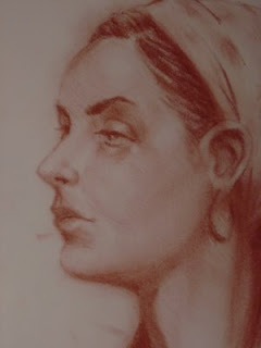
Head Study of a friend

Sanguine Chalk Pastel on 11x14 paper. She used to be a Facebook friend, a fellow artist whose into interior designing from Middle East. Frankly, I forgot her name, I only knew her for a brief period of time. She just poofed out from my list of friends. I was only intrigued of her beautiful middle eastern face and the talent behind it; she is pretty good on what she does. I'm glad I saved her pic and was able to draw her, but, sadly, I wasn't able to show this artwork. I can't believe that I cannot even put a name on a face.


Figure Study

Charcoal on 11x14 paper. It's strange that even before I hit the paper I knew that this time it'll be a different perspective of approach in my study of this figure. I was thinking mostly on treating the light in a more conscientious and intellectual way, and not just by going by instinct of not having my brain "to have a part of it". It came out easy and fast, and not being enslaved by hit and miss, by its tedious detail, by anatomy, or of any other choices an artist has to deal with. I dealt the form by way of looking at light, and with that it came out all together in linear, planar, and light and shadows as I progress. On top of all, everything has to make sense.

Tuesday, June 9, 2009

Head study

Chalk Pastel on 9x12" Strathmore paper. This one was a repro of Lipking's. The ear looks awkward that obviously I don't know what I was doing. The forehead looks short, not proportional to her bigger face inspite of the foreshortening. The sternomastoid muscle in not correctly stressed. Here is the premise: even for a small degree of error from the original the artwork would look awkward, simply because the foundation of the anatomy is weak. The structure of every part is not convincingly articulated. The artist is enslaved by his/her ignorance or lack of mastery. Some really good illustrators, like Jason Seiler, can be exageratedly or grotesquely bent, but could still maintain the facial character of the model. It's not enough if one could anatomically name all the parts (that's the easy part), but still COULD NOT draw without looking at the model. Until one has embedded visually in mind, from bones to muscles, with its contractions and extensions, and can draw them well even without a model in different perspectives and movements, then, in my opinion, the artist has mastered his craft. I thought I still have a long long way to go [sigh].

Dashing Debonair Pierce

Black ballpoint on 9x12" Strathmore paper. I feel comfortable using ballpoint unless they bleed occassionally. The fineness and consistency is what I look for a good ballpoint. It's as versatile as a pencil, I could get darkness or lightness out of it depending how much pressure I put on my drawing. There is only one downside, which is bigtime if one is not careful, and that is, everything you put down on paper is final, no erasures. It's easy if you're used to looking at your artwork as a whole in the first stage before you go on the detail, as it should be with any medium. That way, one is commited to not making many significant mistakes.


Inspired by Jeremy Lipking

Black Ballpoint on 9x12" Strathmore paper. I wanted to know what I can do with Lipking's painting, rendering the light, the main idea of this masterpiece with black ink. Most of his paintings have dramatic lighting and very expressive with his figures. I like the skin tones of his figures that blends well with fuzzy background.