
Tuesday, April 28, 2015
Sunday, April 26, 2015

Friday, April 17, 2015

Thursday, April 9, 2015
#1k16 TedCruz
Charcoal on toned paper. 18x24in.
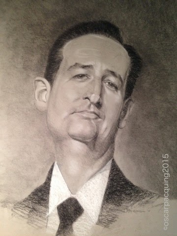
On this portrait I emphasized the toned paper as the middle tone value as it should be. That's what they're made for. The next value to that is the "hard"pencil (General pencil), so I was extra careful on hatching. I hardly used a stump for blending. I also used white General to articulate the highlights even at an early stage to help me see the related values (see the early stages of the drawing below).

On my previous works I use the "medium" and "soft" pencils for my values. I never realized the importance of the "hard" pencil. And because of the light impression of the drawing as a whole I was careful on rendering shadows to avoid mistakes of redoing it - it would look messy.
I thought the background deals a lot with the drawing. And because the tone of the flesh is predominantly the tone of the paper I made the background darker. It gives that effect of making the face pop out.
Subscribe to:
Posts (Atom)