Sunday, March 30, 2014

Sophia IV

Black and white charcoal on rough finished brown paper. 9x12". 
This is my 4th version of Sophia Loren trying to catch her likeness on different style and on different paper. 


Saturday, March 29, 2014

Sophia III

Soft charcoal vine on white paper. 9x12".  I can't get enough of this character so I'm doing another one loose drawing. Vine charcoal mediums are best to use when you're drawing vertically like using an easel. I think any medium should be done on an easel as much as possible so that from time to time you'll have a whole view of your project, and not get caught in one particular area, lest that it will look odd once you step back and see it as a whole. 
The thing with charcoal vines is that it smudges easily and you could lose your drawing. That is why it's always good for preliminary outlining to map out every features and rub it off. I'm not that big in using fixatives.

Monday, March 24, 2014

Sophia 2

Another Sophia Loren charcoal study. I'm trying different styles of drawing charcoal that I might get a good grip of the medium. As the way it goes it looks like it will take more time, more years of portraits, to master it. 


Sunday, March 23, 2014

Jerry

Charcoal on toned gray paper. 11x14".
This is Jerry Garcia, musician-composer, a portrait requested for me to do. I had fun doing this. 


Thursday, March 20, 2014

A study

A study in charcoal. 9x12 inches. White paper.  Good lighting even if it's a photo always helps. That's what I always look for to make my job easier. I wanted a quick-rough study in charcoal. I did this in 2 hours. 

Sunday, March 16, 2014

Classic face of Sophia

Sophia Loren. Charcoal. 11x14" toned gray paper. 


Inspired from Casey's drawings

Charcoal. 11x14 inches toned gray paper. Inspired from Casey Baugh drawings.

I was staring at Baugh's recent drawings on how he rendered light. It's pretty amazing that I see minute details of darks and light on some corners that makes sense. His range of values are wide, and he render it with great care. Those are the point that struck me and made me do a version of my own. The reference for this project was pulled out from black and white photos online.

This project was done last night that is why I'm getting some yellowish background on some pics. I have to wait till next morning to shoot this final product to get a true color to post it.

I enjoyed doing this project. You can do it too if you put your mind to it. Happy drawing!


Friday, March 14, 2014

Caricature studies

6B graphite on white paper. It's been quite some time I haven't done any caricature. I'm trying to see if I haven't lose my touch. 

On this two studies I was trying to approach the primary stage in a different way that I might be able to express the exaggerations right, yet still maintain the likeness of the character. 

I was thinking that if I stare at the reference and imagine the alteration, I might bring out a good result -in a more careful approach. Prior to this, it was just random and see what happens next kind of thing. And honestly, I am not quite satisfied with the results, though I was able to pull out some good caricatures.  Nevertheless, I have to spill a basket of apples to pick a solitary good one, so to speak. Such a waste of time and energy!

So to start I blocked in the whole image with that thought I had of the overall shape of the face (sorry, I didn't shoot anything showing the WIP). Within that block I mapped  the exaggeration of the face resulting like a shape of an inverted triangle in the case of Al Pacino (directly below), and a pear fruit for Brad Pitt (bottom pic). 

Second, I  mapped the exaggerated features the eye sockets and the forehead, the nose, the lips, the cheek bone, and the jaw. I look back to check the outline of the hair if I wanted a thicker or thinner one. No details yet, think of it like sculpting.

 Third, I define the lights and darks of the face and slowly shaping the eyebrows, furrows, and protruding bones  to help me articulate the face. At this stage, more or less, I have an idea the exact exaggeration I wanted. Every step seems to be going smooth. Up to this point, I thought that the overall shape of the face is more important than the detail drawing. 

Now that I pretty much see how I wanted the exaggerations done, I start to draw the details of the eyebrows, eyes, nose, mustache, lips, beard, and neck. 

Normally to start the whole exercise, artists would launch their attack with great details on drawing the eyes, brows, nose, and etc. There is more risk of commiting mistakes on doing that, and most often than not, they end up wasting time and energy, frustrated, pissed, and worn out. That whole baggage kills your passion, your goal, and as a whole, your dream. Some even kill themselves! Please don't do that.

I chose not to emphasize the hair because I wanted my viewers to focus on the face

I hope this little discussion helped you somehow. The operating words here are understressed. And remember, drawing is not only about aesthetic, opening your right brain makes all things work out. If the early stage of your work seem not working, most likely it's not going to work, or you will struggle through out the end. So do it right. Keep it spiffy. Happy drawing!


Wednesday, March 12, 2014

A sketch for the day

I just have this urge to do a quick drawing.  I'm throwing in more of the pics to show the stages of the process. I was in the mood to shoot more.  They are self explanatory, I suppose, or you might want to check the project prior to this on a more detailed explanation of the steps. 
Think that you can do it too. Happy drawing.


Monday, March 10, 2014

Sweet water

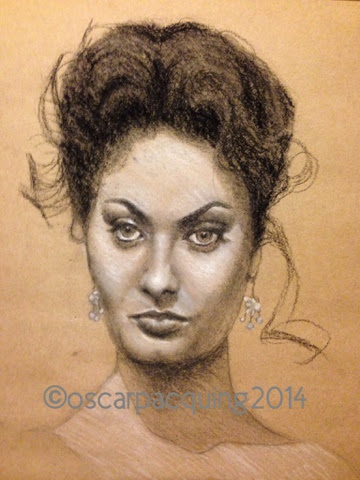
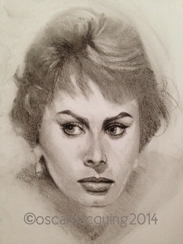
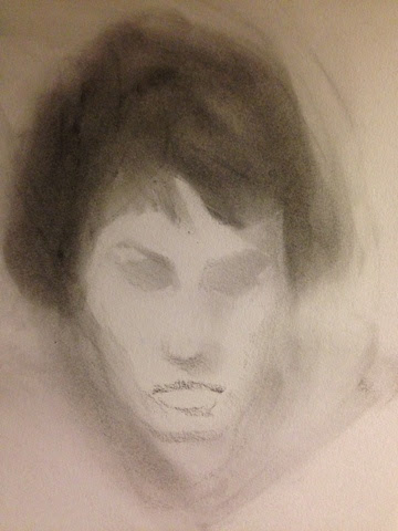
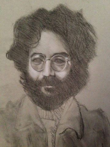
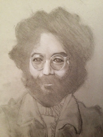
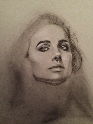
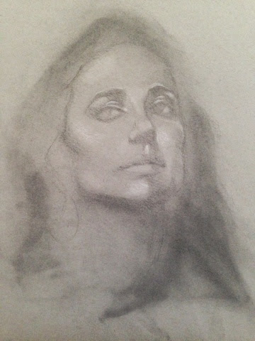
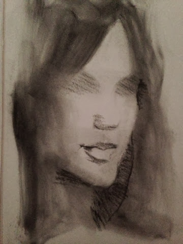
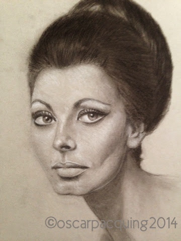
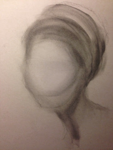
Charcoal in white paper. 9x12 inches. Below is showing the 3 stages of the progress.

Artist Casey Baugh's demo emphasized his approach on drawing/painting, and they are in the following sequence: value, color (if you're using it), edges, and then drawing. 

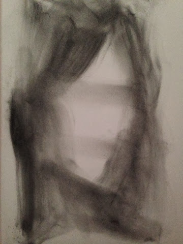
I started throwing in smudges of charcoal powder to where I think the dark tones are going to be mostly. In the pic at bottom such case is the bangs on the face, the sides, and the area where the hands are going to be. 

Next I started sculpting the figure with the use of a kneaded eraser. At the same time I began attacking the darker tones with the use soft charcoal vine, trying to define that soft and hard edges of the face. At this stage I didn't have to worry about the details- just block in the eyes socket, nose and lips. Repeat the same process moving on to the glass and fingers. At this stage think of mass of values, not lines and boundaries. To push the smudges smoothly I use Sofft knives or you can use stumps or the ever handy cute tips. 

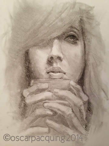
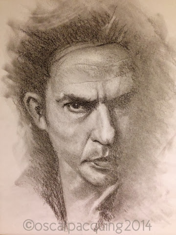
Next stage as showing at the middle pic, continue working on the edges and some details, slowly sculpting to its likeness. Use the eraser for defining reflected lights and widened your tones from the darkest to the lightest. 

I try to stay loose as I work on its likeness and give a bit of my interpretation for a more original version. Don't be so uptight on details that you desperately want to perfect the likeness. It's going to drive you crazy.  This exercise is suppose to be  "cruise drive". 

Reference for this is a photo. The tools I used are the following: charcoal powder, soft sable brush, soft charcoal vine, soft charcoal pencil, stump and Sofft knife, and a kneaded eraser. 

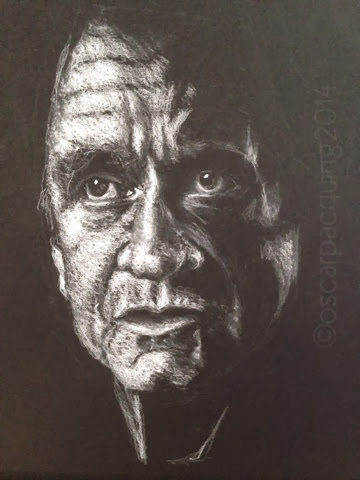
I hope you find this little tip helpful for your own drawing journey.  Happy drawing!!!


Charcoal. 9x12 inches. Whtie paper. Another study of same Baugh style. 

Saturday, March 8, 2014

Thursday, March 6, 2014

Cashing in Cash

Johnny Cash. White on black etude. Still trying to get used to drawing white on black paper. Holding the pencil on the tip is important for me, alla artist Zimou Tan, so I don't tend to put more white more than I should. Moreover, I wanted lesser light on Cash's face than what it looks in the photo reference to give more drama and originality.

 For now most of my artworks are relatively small, ranging from 9x12 to 11x14 inches dimensions. I thought that small projects like these finish fast and keep me from boredom. Mostly, if not all, are done in two seating sessions because of time constraints. 

Sunday, March 2, 2014

Eureka!

Still pushing on how can I make it better. I watched artist Zimou Tan on Youtube for a bit more on how he does his white on black drawings, trying to look for something I could pick up from his incredible skill.  Then I thought of holding exactly the way he does with his pencil or sticks -at the very tip of it.  In school we were taught to hold it in somewhat similar way but not so much of an emphasis. But I discovered that holding at the very tip makes sense.  You just need so much of pressure to make a desired mark. You get more control of not puting so much. It feels awkward at first but you'll get the hang of it. Of course, you got to have an easle holding your paper vertically.

Smoke

Another white on black surface. Just trying to explore more. Nothing satisfies me more than waking up early morning to start drawing and finishing up as the day is just starting. That way I have accomplished one already and still have a full day ahead of me. 

Saturday, March 1, 2014

Young lady

Graphite on white paper. I got inspired looking through the gallery of artist Daniel Bilmes. I thought that he's a great artist. I love his drawings, his paintings, and his style. 
I read it somewhere that to own your style is to mix all the styles you try to emulate. You don't consciously seek for them, they come out naturally as you thrive to express your own art.