Wednesday, January 30, 2013

James Dean

Charcoal on brown paper. As what Saper said, that in painting, or drawing for that matter, there are always 2 sections, light and shadow. Even the lightest in shadow should be darker than in the light section. And to indicate the direction of light source I made the background lighter on the right than the left side. Obviously, there are 2 sources of light that was rather diffused, right and front side.


Monday, January 28, 2013

A Study

Oil Pastel on medium brown paper. This is a study of shadows and lights, and at the same time experimenting with warm and cool colors. A grayed down blue on the left side of hair is designated as cool color. The yellow on the right side forehead as warm color. Many elements of shadow and light played along the way trying to control either side to make sense.

Friday, January 25, 2013

Johnny Cash

Black and white charcoal on brown paper. My version of Cash caricature.


I always love Johnny Cash and his songs.  Love his movie and his music.  I was first introduced to him and his music when I was in a band in my younger years where I played fiddle.  And my favorite one is "Folsom Prison".  Makes me wonder why would somebody like to compose a song about prison story unless he or she was once in it.  Sure enough he once spent some time in the slammer.  And another cool thing about it is when he went back to the same prison, not for another term, but to give a concert.  The guy is truly a legend.

Thursday, January 24, 2013

Philip Seymour Hoffman in progression


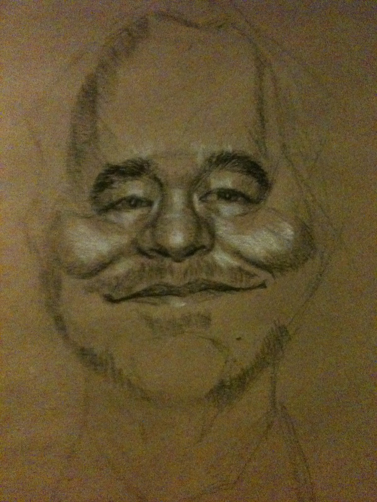
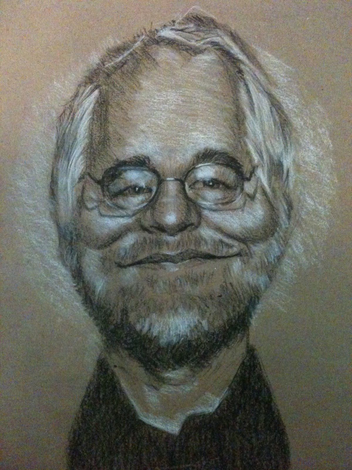
Caricature in black and white charcoal in Borden&Riley Kraft Brown Pad.  I am not so much of a fan of white charcoal but I thought of using it as its effect on some other artist artwork looked pretty cool.  I am still trying to discover on how to really express light reflection by the use of white charcoal. 
I didn't do any sharp edges around the subject to keep the viewers focused on the face, especially on the high contrast on the reading glasses.
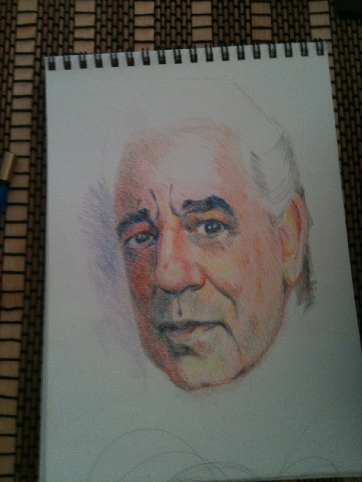
One of my fav actor, Philip Hoffman, always play an interesting character.

Megan


I discovered that oil pastel is one of those medium where when applying it one would not see results right away since one has to keep on piling layers and layers till you get the kind of result your looking for.  It takes time.  The medium doesn't spread easily and with the right corner of the pastel stick you can only get right edges of line or stroke you wanted.  One has to have real patience in using it.  I must admit I'm still new on this.

Young Girl


This painting is inspired from the painting of Chris Saper.  I just thought of copying this one to learn how she would treat this painting with colors.  This was my first time to use oil pastel.  It's a bit challenging because it's not easy to apply them and so one would spent a bit more time cover the paper layer after layer as this medium doesn't spread easily. Making sharp edges is just not working with this medium. 

Placido Domingo


Colored pencil in a Stratmore medium paper.  Upon reading Saper's book I thought of applying what I learn right away.  I wanted to use colors but not something like jumping into watercolor or acrylic, but I am more concern of the instant result of my own rendition. I have yellow and orange as my warm colors.  Blue and blue green as cool colors.  To soften the saturation, I use the color of interest mixed it with its complementary color - it's what Miss Saper calls "grayed downed".  There are some flaws I see like there's a bit too much of saturation on the side of the nose- it's facing the light. The sharp edge on the left side of the face should not be there since that is the cooler side of the subject. I was not sure what I did with the hair.

Thinking of Colors

I think the information one can get from this is a treasure, as she laid the principles of colors and painting that is pretty easy to understand and that it makes sense. Of course, one would have to apply this principle and practice it as often as possible to be able to master it.  If you relate to my situation this book might also work for you.  I recommend it. The best book about colors I've ever read, so far.

Study of Kennedy


Nigel Kennedy

Caricature in charcoal.

Some subjects I do more than once or twice as I would always try to explore and see how and where can I improve. Nigel is one of them.

Nigel Kennedy

Caricature in charcoal on Bristol Vellum.

James Gandolfini

The Soprano Guy. Caricature in charcoal.

Daniel Craig

Caricature in Bristol Vellum.

Robert Pattinsson

Caricature in Bristol Vellum.

Matt Kemp


Above is a caricature of Kemp of LA Dodgers.

Beethoven


I was exploring on doing a caricature of Beethoven.  On top is done on sanguine and the one above is in charcoal. I guarrantee that this is not the last of it. I may have to do it in another medium.  I am just not satisfied with this two.  I am posting it anyway to show how some works are just not working the way an artist would want.  For me this process is the same as when composing a written idea or thought; no matter how much you think you're done, you keep on editing and revising the sentences unless you stop reading it.  Get my drift?
Luke Perry. Caricature in graphite. Quick study.

Amadeus Mozart.  Quick study in caricature. Graphite on paper.


Abe Lincoln. Quick sketch in Ink on paper.

007 James Bond, Caricature in charcoal on Borden & Riley brown paper.  Sorry fellas, if you think my "sheer love in drawing" is kind of flickering, trust me, it's NOT.  On the contrary, it has gone wild like a brush fire.  I have tons of projects made overtime I was not around on this blog.  I know I have to also take care of this baby but I will do a better job next time. You might notice that I have a series of posts, and definitely I won't be able to post all of the works I have in one sitting. Please be patient. It's all coming. Again, I apologize for the long absence on this blog.